
Blog
Why Your Room Still Feels Boring Even With RGB Lights
RGB lights are everywhere now, from gaming desks and bedrooms to TV walls and streaming setups. That popularity makes sense: the broader lighting and smart home sectors keep expanding as consumers spend more on connected home upgrades and atmosphere-driven design. In the U.S. alone, the smart home market was estimated at $23.72 billion in 2024 and is projected to keep growing rapidly, while the global lighting market reached $142.49 billion in 2025. But market growth does not guarantee better rooms. A lot of people buy RGB products and still end up with a space that feels generic, cluttered, or emotionally flat.
The reason is simple: color alone does not create atmosphere. A room feels memorable when light adds depth, supports function, highlights surfaces, and creates emotional contrast. Interior lighting guidance consistently emphasizes layered lighting rather than relying on one glowing source. Designers typically separate lighting into ambient, task, and accent layers because each one changes how a room feels and works. When RGB lighting is used as a single trick instead of part of a system, the result often looks more like decoration than design.
The Real Problem: You Added Color, But Not Depth
The most common mistake is assuming RGB equals atmosphere. It does not. If all the light comes from one strip around the ceiling or behind a desk, the room may become colorful, but it will not automatically feel immersive. Human eyes respond strongly to contrast, shadow, material texture, and focal hierarchy. A room becomes visually rich when some areas glow softly, some surfaces catch highlights, and certain objects become intentional points of attention. Without that layering, even expensive lights can make a room feel flat.
This is why many RGB rooms look good in product photos but disappointing in daily life. Photos are usually staged with furniture styling, wall texture, camera exposure control, and multiple supporting light sources. In real homes, users often install one light source and expect the same effect. The missing ingredient is not brightness. It is composition.
1. Your Lighting Is Not Layered
Lighting experts and home design professionals repeatedly emphasize layered lighting because it creates flexibility and depth. Ambient light gives overall glow, task light supports activities like reading or working, and accent light draws attention to features such as wall art, shelves, or a textured headboard. When a room has only RGB ambient glow but no task or accent support, it often feels unfinished.

For example, a gaming desk setup with RGB behind the monitor may look colorful, but it still feels dull if the wall is blank, the desk surface has no focused pool of light, and there is nothing else guiding the eye. The solution is not always “more RGB.” Often it means adding one warm desk lamp, one wall-focused light feature, and a softer background glow.
Quick Fix
Use RGB as one layer, not the whole room. Build your room with:
- one base glow
- one functional light
- one visual highlight
2. The Light Is in the Wrong Place
Placement is often more important than the light product itself. Indirect lighting usually feels more premium because the source is hidden and the glow reflects off walls, furniture, or panels. Directly exposed LEDs can create glare, reveal cheap installation, and make the room feel more like a gadget display than a designed environment.
The U.S. Department of Energy notes that good lighting design is not just about efficiency but also about light quality and where light is used within the space. That is exactly why two rooms using similar products can feel completely different. The better room usually has better bounce, softer transitions, and more intentional focal lighting.
Best Places for RGB or Ambient Wall Lights
- behind the TV wall
- behind the headboard
- beside shelving or display pieces
- above a desk wall composition
- around textured wall panels
3. You Chose the Wrong Colors for the Mood You Want
Many users choose colors based on what looks exciting in the app, not what feels good in the room. Saturated red, blue, and purple can be dramatic for a short time, but if every night looks like a nightclub, the room loses comfort. Warmer tones and balanced scenes usually work better for bedrooms, relaxed evenings, and daily living.
This matters even more at night. Research has found that blue-enriched or high correlated color temperature light in the evening can have stronger effects on arousal and melatonin-related processes than warmer light, which is one reason sleep guidance typically favors warmer evening lighting over cool blue-heavy light.
That does not mean blue or purple are bad. It means they should be used intentionally. Cool tones are great for gaming, music sessions, and energetic scenes. Warm tones are better for unwinding, watching movies, and making a room feel more human.
Rule of Thumb
Match the color to the emotional job of the room:
- warm amber for comfort
- soft white for everyday living
- cool blue for focus or futuristic style
- purple or pink for mood accents, not everything
4. Your Room Has Nothing for the Light to Interact With
Light needs surfaces, texture, and shapes. If the room has plain empty walls, no layered furnishings, and no focal décor, the lights have very little to work with. This is one of the biggest reasons RGB setups disappoint. The user blames the lights, but the real issue is the environment.
Interior designers often talk about lighting and materials together because finishes, fabrics, wood grain, matte walls, and sculptural elements help create dimensionality. Layered lighting brings those textures to life. Without them, the space can remain visually empty even when illuminated.
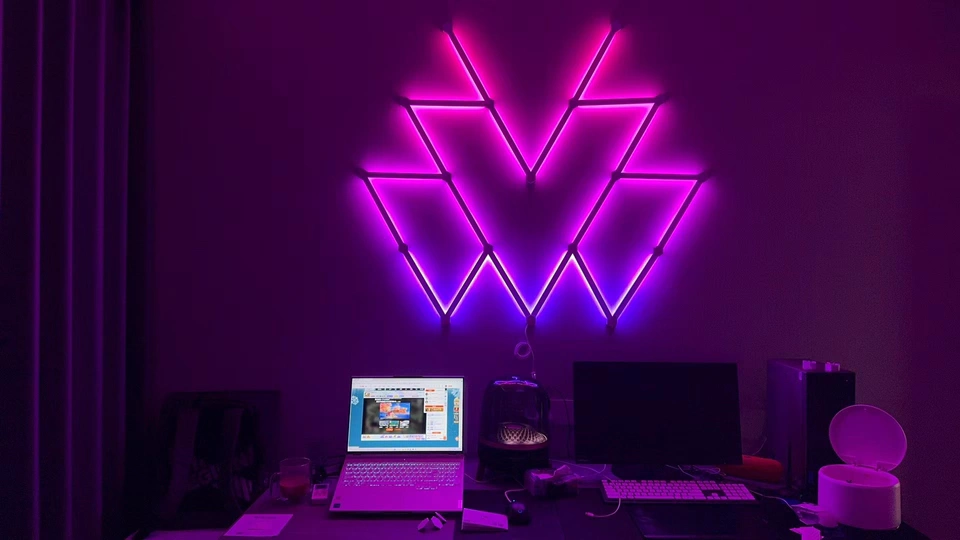
This is also why modular wall lighting can be so effective in modern rooms. It does not just emit color. It adds shape, rhythm, and identity to the wall itself. For a brand like Nanobee, that matters. The product is not only a light source. It is a visual feature.
5. Your Room Is Too Bright Overall
Some rooms still feel boring because the main ceiling light is doing too much. If the overhead fixture floods everything with flat brightness, your RGB accents lose impact. Accent lighting works best when there is some contrast. Not darkness, but controlled balance.
This is why many premium setups rely on a lower baseline light level and then build visual atmosphere with controlled accents. Mood lighting is not about making a room dim for no reason. It is about deciding where attention should go.
6. The Setup Has No Story or Theme
A room feels boring when it has no identity. Random lights placed in random zones do not create immersion. They create noise. Strong rooms usually follow a clear direction:
- cozy minimalist
- futuristic gaming
- music studio vibe
- calm hotel-like bedroom
- creator backdrop
- smart home showroom feel
When users feel disappointed by RGB, what they often mean is this: “I added lights, but my room still does not feel like me.” That is not a product failure. It is a design mismatch. The best lighting products make sense inside a mood concept.
For Nanobee, this is a major branding opportunity. Instead of selling only “smart lights,” sell room identity. Sell scene-building. Sell transformation.
What Actually Makes a Room Feel Exciting?
A room usually feels exciting when it has five things working together:
- A focal point
- Light at multiple heights
- A balance of glow and shadow
- Texture or shape on the walls
- A scene that matches the user’s lifestyle
That is why wall-mounted modular lighting, indirect TV backlighting, shelf accents, and bedside mood scenes often outperform one long strip around the ceiling. The result feels more architectural and less temporary.
A Better RGB Strategy for Small Rooms
Small rooms do not need more products. They need smarter composition. A strong setup can be built with:
- one wall feature light
- one soft desk or bedside light
- one indirect backlight zone
- one scene preset for day
- one scene preset for night
This approach works better than covering every edge with LEDs. It also looks cleaner in photos, which matters for users who share their setups online or use their rooms for content creation.
The e-commerce market for lighting has also continued to grow, which means consumers are seeing more products than ever online. In that environment, brands that explain how to use light well, not just how to buy it, have a stronger chance to win trust and conversion. That is especially relevant for a consumer-facing brand like Nanobee.
Table: Why RGB Rooms Fail and What to Do Instead
| Common Problem | Why It Feels Boring | Better Solution |
|---|---|---|
| Only one RGB strip | Color without depth | Add task and accent layers |
| Lights are too exposed | Harsh glare, cheap look | Hide the source and use indirect glow |
| Colors are too saturated | Room feels tiring, not livable | Use warm or balanced presets |
| Blank walls | No texture or focal point | Add wall lighting or visual features |
| Ceiling light too bright | Kills contrast and mood | Reduce overhead intensity |
| No style direction | Setup feels random | Build around one room theme |
Nanobee’s Brand Opportunity: Do Not Sell Just Lights, Sell Atmosphere
For Nanobee, this topic is more than a blog idea. It is a positioning strategy. Most brands in the lighting space still sell specs first: RGBIC, app control, brightness, scenes, voice assistant support. Those features matter, but they are not what users emotionally buy.
Users buy:
- a better mood after work
- a more impressive room on camera
- a cozier bedroom at night
- a gaming setup that feels immersive
- a living space with more personality
That means Nanobee content should repeatedly answer one question: How do you make a room feel alive, not just colorful?
This article supports that strategy because it solves a real frustration, creates trust, and naturally leads the reader toward higher-quality ambient wall lighting solutions. That is good for SEO, useful for GEO, and strong for brand memory.
Where to Insert Visual Assets
Recommended Chart
Insert after the introduction.
Chart idea:
“Why RGB Rooms Fail: Top 5 Design Mistakes”
Use a simple bar chart showing:
- no lighting layers
- poor placement
- wrong color choice
- blank walls
- too much overhead light
Recommended Table
Insert after the “A Better RGB Strategy for Small Rooms” section.
Use the table above directly.
Recommended Before/After Visual
Insert after “The Real Problem: You Added Color, But Not Depth.”
Conclusion
If your room still feels boring even with RGB lights, the issue usually is not the technology. It is the design logic behind it. Color alone cannot replace depth, texture, placement, and purpose. The best rooms use light to guide emotion, shape attention, and support the way people actually live.
That is the difference between a room that simply glows and a room that feels unforgettable.
For Nanobee, that is the message worth owning:
Do not just light the room. Shape the mood. Build the atmosphere. Make the space feel alive.