
Blog
Why Your Room Still Feels Boring Even With RGB Lights

RGB lighting is no longer niche. It sits at the center of modern bedrooms, gaming rooms, streaming setups, TV walls, and small apartment makeovers. That growth reflects a bigger retail trend: the global lighting market was valued at $142.49 billion in 2025, and the U.S. smart home market was estimated at $23.72 billion in 2024, with strong projected growth ahead. In other words, consumers are spending more on lighting not only for visibility, but for mood, personalization, and connected-home convenience.
And yet a common frustration keeps showing up in search: “Why does my room still feel boring even with RGB lights?” That is a valuable retail question because it reveals a gap between what buyers expect and what most products alone can actually deliver. People think they are buying atmosphere. Often, they are only buying color.
The truth is simple: color by itself does not create a compelling room. A memorable room needs visual depth, contrast, purpose, and a clear mood. U.S. Department of Energy guidance on residential lighting emphasizes matching lighting to function, using task lighting where needed, and recognizing that light quality matters as much as quantity. That is exactly why a room can be full of LEDs and still feel flat.
What the Customer Really Wants When They Search This Topic
A shopper typing this query is usually not asking for a technical explanation of RGB chips. They are asking a more emotional question: “Why does my room still not feel the way I imagined?”
From a retail perspective, the search intent usually includes three hidden needs. First, they want validation that the problem is common and fixable. Second, they want practical design advice, not just product specs. Third, they are highly open to buying a better solution if the content clearly explains what went wrong and what to do next.
That makes this keyword powerful for commerce. It sits close to purchase intent because the user is dissatisfied with a current setup and is already mentally prepared to upgrade, reposition, or add complementary lighting.
The Core Problem: RGB Adds Color, Not Automatically Atmosphere
Many buyers assume RGB lighting works like a shortcut. Install a strip, pick purple or blue, and the room should instantly feel cinematic. In real life, that rarely happens.
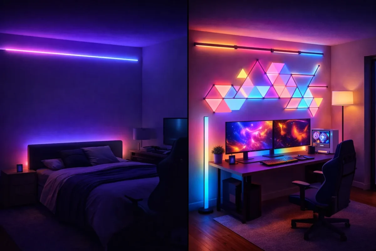
A room feels immersive when lighting creates layers, guides attention, and interacts with surfaces. Lighting experts commonly divide residential lighting into ambient, task, and accent layers because each one serves a different visual and practical role. When a room has only one RGB source, especially a single ceiling strip or desk backlight, it may look colorful but still feel empty.
This is one reason staged social media rooms often outperform real homes. In photos and short videos, creators usually control exposure, furniture composition, shadows, wall texture, and secondary lamps. The buyer at home often installs just one light source and expects the same result.
Mistake 1: You Are Using RGB as the Whole Lighting Plan
The first and biggest mistake is turning RGB into the entire room strategy. A room needs more than glowing color. It needs structure.
Residential lighting guidance consistently stresses that general light should be complemented by focused light where people actually work, read, watch, or relax. If the only visible effect in a room is a colored strip around the ceiling, the setup often feels decorative but not designed.
A better approach is to treat RGB as one layer within a wider experience. A soft ambient glow can set the mood, a task lamp can create function, and one accent light can add focal interest. That simple combination usually feels more expensive and intentional than adding a second or third random LED strip.
Mistake 2: The Light Is in the Wrong Place
Placement matters more than most people expect. Exposed LEDs often create glare, highlight installation flaws, and make the setup feel cheap. Indirect light usually feels more premium because the source is hidden and the eye sees the reflected glow instead of the harsh emitter.
The Department of Energy’s consumer guidance emphasizes that good lighting design is about quality and function, not just brightness. That is why two rooms using similar products can look completely different. The better room usually has more bounce, softer transitions, and clearer focal zones.
For retail buyers, this matters because the “best” lighting product can still disappoint if it is placed badly. Behind a headboard, behind a TV, under shelving, or around wall features, RGB lighting often performs far better than when it is fully exposed around every edge of the room.
Mistake 3: Your Color Choices Do Not Match the Mood You Want
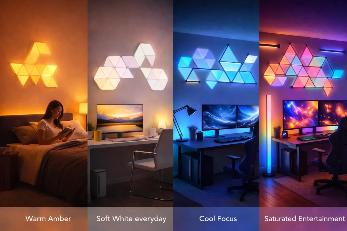
A lot of people choose colors based on novelty rather than how they want to feel. The app makes saturated blue, red, and purple look exciting, so those become the default. But excitement is not the same as comfort.
Research on evening light exposure has found that blue-enriched light is associated with stronger alerting and circadian effects than warmer light, and Harvard Health notes that blue light at night can suppress melatonin more powerfully than some other wavelengths. That does not mean blue is “bad,” but it does mean color temperature and timing affect how a room feels in daily life.
This is where many setups fail emotionally. If the room is meant for winding down, movie watching, or late-night comfort, aggressive cool tones can make it feel less human and less restful. Warm whites, amber scenes, and lower-saturation color mixes often make rooms feel more usable and more premium.
Mistake 4: Your Room Has No Surfaces for Light to Work With
Light needs something to reveal. Empty walls, flat furniture, and no visual focal points can make even good lighting underperform.
When lighting hits texture, matte paint, shelving, artwork, wood grain, fabric, or modular wall shapes, the room gains dimension. Without those surfaces, the light has little to interact with, so the result feels thin. This is why lighting and interior styling are closely linked in practice. The room is not only lit; it is being visually edited.
This matters for retail because many shoppers think they need “more lights” when they actually need more composition. One wall feature, one textured zone, or one intentional furniture vignette can improve perceived atmosphere more than another strip around the ceiling.
Mistake 5: Your Main Ceiling Light Is Killing the Mood
Another common issue is overlighting the room with a bright overhead fixture. If the ceiling light floods everything evenly, the RGB accents lose contrast and the space looks flat again.
This connects directly to energy and residential lighting guidance that recommends installing light where needed and avoiding the idea that more light is always better. Atmosphere depends on hierarchy. When everything is equally bright, nothing feels special.
For many rooms, the answer is not darkness. It is a lower baseline level of general light, with stronger emphasis on the parts of the room that should attract attention.
Mistake 6: The Room Has No Theme
Some rooms feel boring because the lighting does not support a clear identity. Buyers often collect effects instead of building a mood. One wall is blue, the desk glows purple, the TV flashes rainbow, and nothing visually belongs together.
A better room usually follows a concept: cozy minimal, modern gaming, creator backdrop, soft hotel-style bedroom, or smart-home showroom. Once the theme is clear, lighting choices become easier. The room starts to feel intentional instead of random.
This is also where brands can stand out commercially. Shoppers do not only buy LEDs. They buy a version of themselves they want the room to express.
Mistake 7: You Expected the Product to Solve a Design Problem
This is the most retail-relevant insight of all. Sometimes the product is fine. The expectation was wrong.
A lighting product can provide color, app control, automation, and effects. But it cannot automatically create balance, texture, furniture styling, or visual hierarchy. That part comes from design logic.
This is exactly why content around “why your room still feels boring” performs well. It speaks to a real mismatch between product marketing and room reality. The brands that solve that mismatch best are the ones that educate buyers, not just sell them another light.
What Actually Makes a Room Feel Better
A room usually feels more engaging when five things are working together: a focal point, multiple light heights, a balance of glow and shadow, surfaces with texture, and a lighting scene that matches the way the room is used.
That is why a setup with one indirect backlight, one warm task lamp, and one wall-focused accent often beats a room covered in uncontrolled RGB. The first approach feels composed. The second often feels busy but emotionally empty.
A Better Retail-Friendly Formula for RGB Rooms
For most bedrooms, gaming spaces, and apartment rooms, a better formula looks like this:
Start with one ambient source that gives the room a soft base glow. Add one practical light for reading, desk work, or bedside use. Then add one visual highlight, such as a TV wall, shelf edge, or wall-mounted feature. Finally, build two or three saved scenes in the app so the room can shift between day, evening, and entertainment modes.
That approach is easier to explain, easier to photograph, easier to sell, and easier for buyers to copy successfully.
Comparison Table: Why RGB Rooms Fail and What to Do Instead
| Common Problem | Why It Feels Boring | Better Solution |
|---|---|---|
| Only one RGB strip | Color without depth | Add task and accent layers |
| Exposed LEDs everywhere | Glare and visual clutter | Hide the source, use indirect glow |
| Overly cool or saturated colors | Room feels tiring or artificial | Use warmer scenes for everyday living |
| Blank walls and flat surfaces | Light has nothing to reveal | Add texture, shelving, art, or wall features |
| Ceiling light too bright | Kills contrast and mood | Lower general brightness and build focal zones |
| No room theme | Lighting feels random | Build around one clear mood or use case |
What This Means for Brands and Retailers
This topic is valuable because it lets a lighting brand move beyond commodity selling. If a retailer only talks about RGBIC, app control, lumens, and sync modes, it sounds like every other listing. If it explains why rooms fail and how to fix them, it becomes useful.
That difference matters in a fast-growing category. As smart-home and lighting markets expand, shoppers have more options and more confusion at the same time. Educational comparison content, design-led buying guides, and room-transformation examples build more trust than spec-heavy sales copy alone.
Conclusion
If your room still feels boring even with RGB lights, the issue usually is not the idea of RGB itself. The real issue is that lighting has been treated like a shortcut instead of a system.
Atmosphere comes from layering, placement, contrast, texture, and intent. The room has to feel designed, not just illuminated. That is what today’s shoppers are really searching for, and that is why this topic matters so much in retail content. It does not just answer a question. It helps buyers understand what kind of solution they actually need.
FAQ
Why do RGB lights look better online than in real life?
Because staged photos and videos usually include better furniture styling, multiple hidden light sources, and more controlled camera exposure than the average home setup.
What color lights make a room feel cozy?
Warmer scenes such as amber, warm white, and low-saturation sunset tones usually feel more comfortable for evening use than aggressive cool blue scenes.
Are RGB lights enough for a bedroom?
Usually not by themselves. Most rooms feel better when RGB is combined with task and accent lighting for depth and function.
What is the biggest mistake people make with RGB lights?
Relying on one light source to create the entire mood of the room.